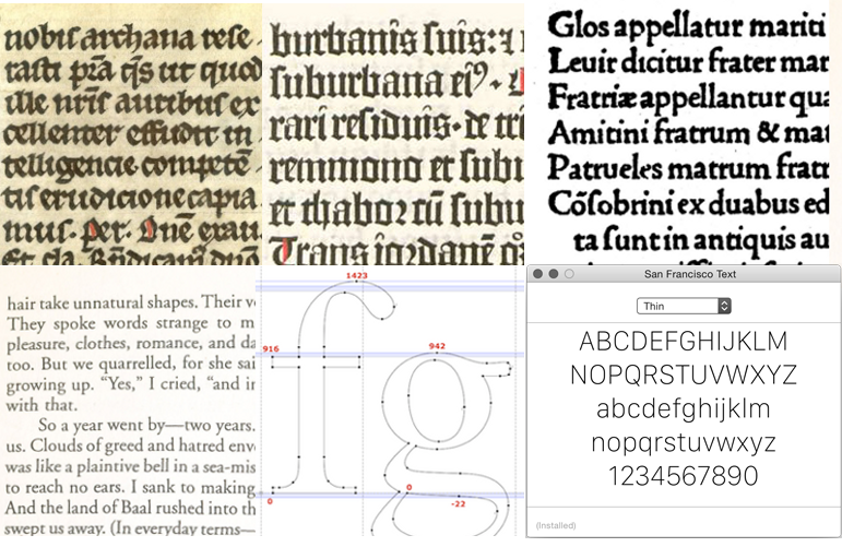
To start off I will say that as of 2016 typography is again a thing of beauty and is being executed with great skill by many on sites in apps or on a variety of screens.
However I journeyed through the dark times that were the early internet and the era when type had been taken away from the designer and reduced to mere code. All the love and passion for a well-crafted headline or elegantly space body copy was lost for the raw rss feed and system fonts.
We have seen this all before from monks by candlelight to Gutenberg’s moveable type. Typefaces were cut manually by the first punch cutters and early type foundries, and the age were many of the typefaces we relate to emerged. Hand crafted pieces of metal, wood or ceramic with names like Garamond and Baskerville which are still in computers today .
Industrialisation moved on to the digital age and new challenges/opportunities arose. It is here that for the printed word much was created and tried that grew the role of the typographer in forming our modern world.
In the computer age the proliferation of typefaces and type manipulations represents a new level of visual pollution threatening our culture. Out of thousands of typefaces, all we need are a few basic ones, and trash the rest. — Massimo Vignelli
It was largely the growth of postscript from adobe and the first apple computers that gave access of typography into the hands of every designer. Those heady days were type could be pushed and pulled beyond reasonable limits. Publications like raygun breaking the accepted norms of what is type and readability to see just how far it could go I remember well. Sitting with a headline and kerning each and every letter to make the overall presentation create the right feeling the words conveyed, or massaging a paragraph to move just one word to return for page balance.
Today much has been done with the introduction of google fonts but most remain unavailable as part of the lowest common denominator safe set of fonts. And therefore designers general have to have a fall-back position to use these.
If we venture down the still archaic world of email it is even worse as you are left to the foibles of email clients and the lack of adherence to any consistency and lagging behind the web by about 5 years.
So where does that leave the typographer. You can no longer be prescriptive as to exactly how the viewer experiences the content but must be aimed at representing typography not through typefaces but what looks best and what feels right. Communicating the message is the essence.
“Typographical design should perform optically what the speaker creates through voice and gesture of his thoughts.”, — El Lissitzky
Typographic perfection on the printed page was an admirable pursuit but in the age of apple watches and screens from 320 to 5k its altogether impossible. Human beings aren’t perfect. Perfection is something that will always elude us.

Craftsmanship will always remain and when its headline news that the font San Francisco will replace Helvetica we as typographers are at the forefront of what it is for humans to interact with the digital world.
Footnote: much of this article was germinated and inspired by the work of Matej Latin who can be found at https://medium.com/design-notes and http://matejlatin.co.uk/
