Making savings visible
The right visuals: helping customers understand their savings through data
- client
- Westpac Live
- role
- Customer experience designer
- focus
- Design sprints · Workshop facilitation · Data visualisation · Behavioural messaging · User testing
impact at a glance
- 3
- customer questions behind every visual: Where am I? Am I on track? Show me how.
- 1:1
- moderated testing rounds on clickable prototypes
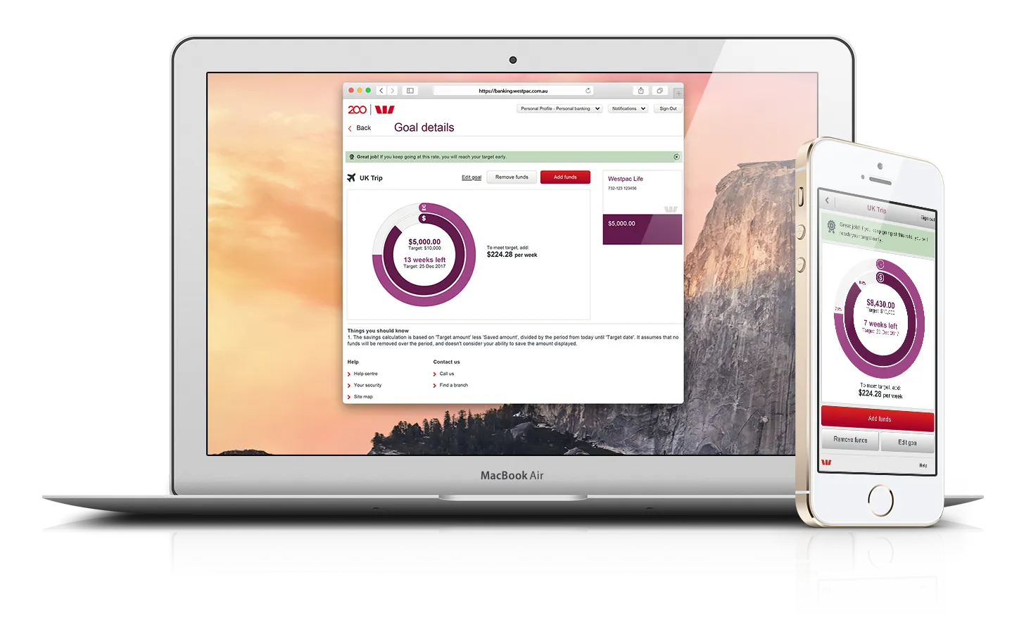
The problem space
Westpac Live was launching a new savings product called Life, and the business wanted a better visual presentation for it. The business objective was clear. The right visualisations to use were not.
My role
As the customer experience designer for Westpac Live, I owned the work end to end: facilitating stakeholder workshops, user research and testing, sketching, detailed wireframes, and clickable prototypes, through to delivery in a fast-moving agile environment.
Process & artifacts
Discovery
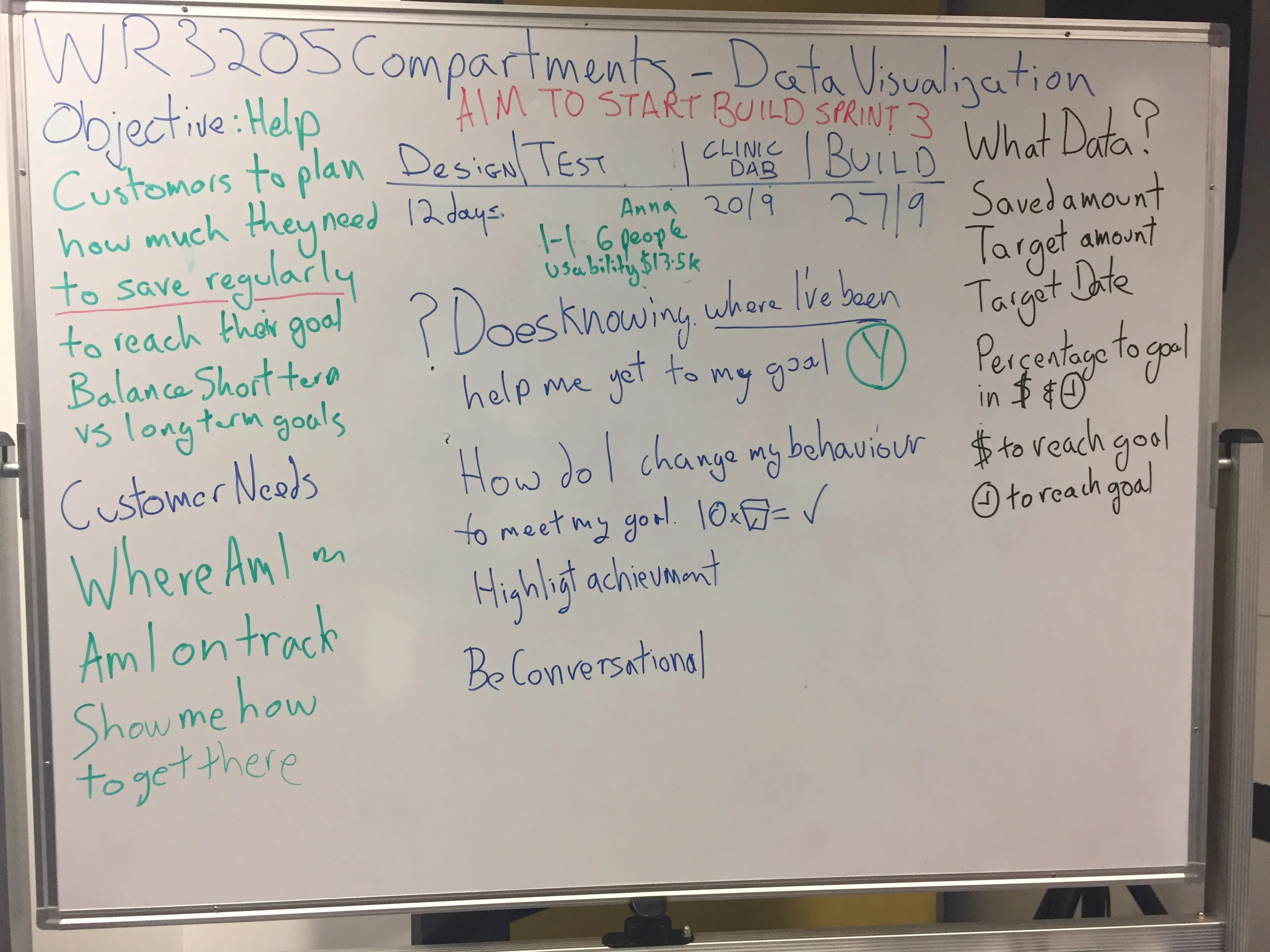
I ran a series of quick design sprints to find out what customers needed around savings. The first discovery workshop established what data was needed and the three key drivers for customers:
- Where am I?
- Am I on track?
- Show me how to get there.
Prototype & test
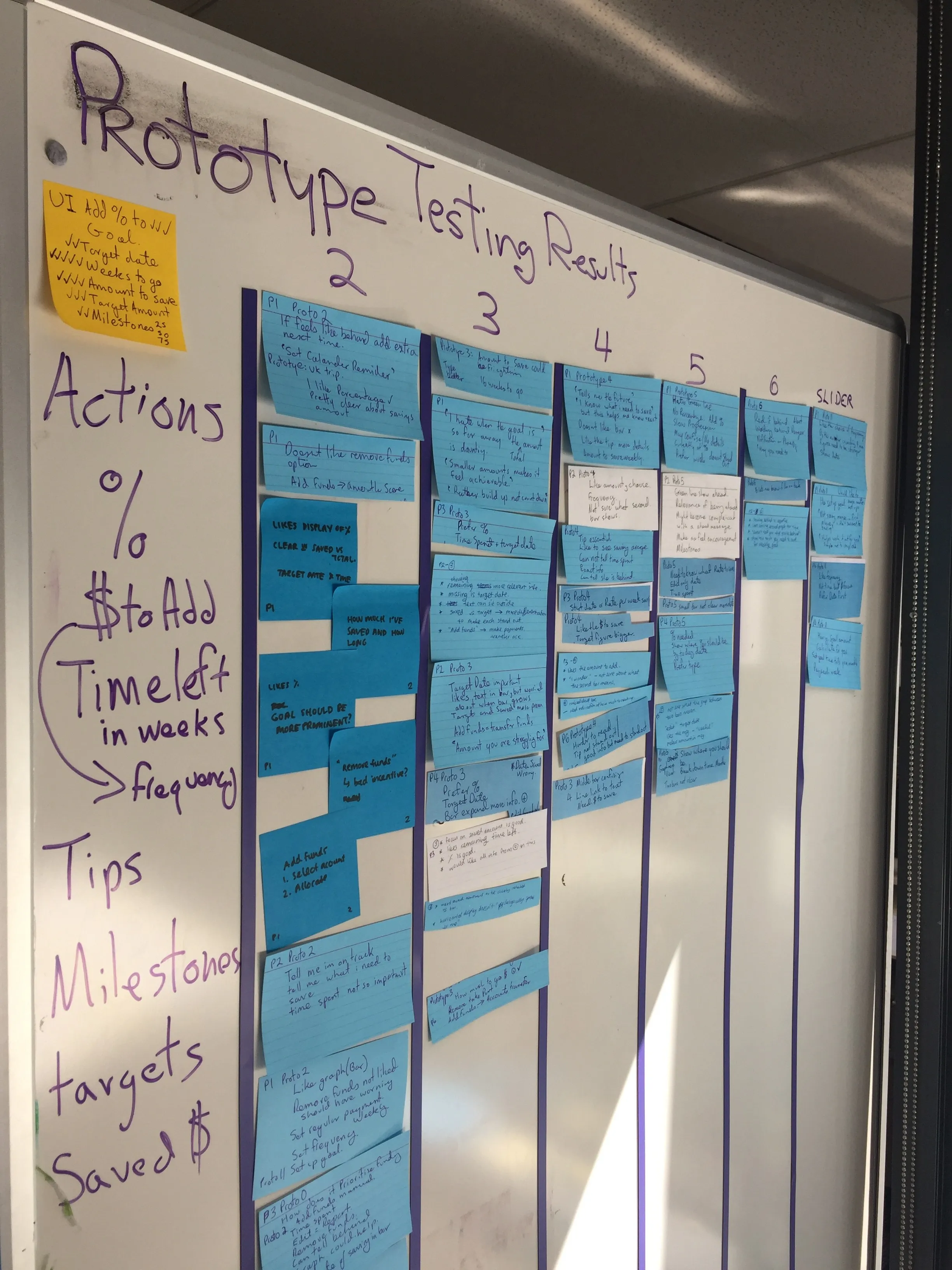
After several rounds of design, I took the prototypes into moderated one-on-one testing with customers.
Behavioural nudges
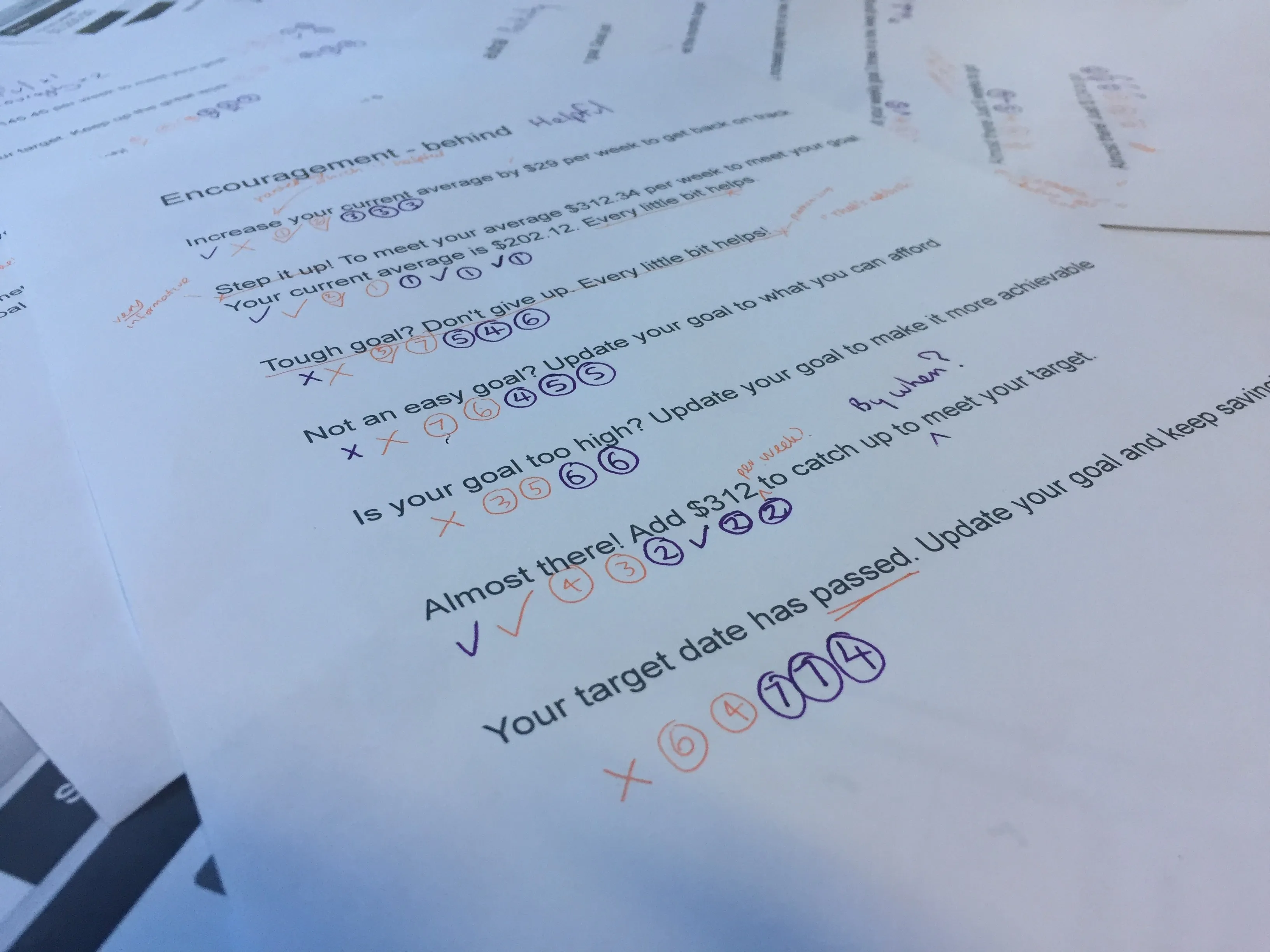
Alongside the visuals, we chose behavioural messaging to work with them, such as “Almost there!” and “Your target date has passed. Update your goal to keep going.” Everything was then brought together into the final designs.
Impact
The final experience gave customers one clear view of where they stood against their goal, whether they were on track, and what to do next, all of it validated with customers before it shipped.