5 Sept 2013
colour gives you the feels
Why do you get the blues, go green with envy or see red? How colour carries emotion, and how brands use it.
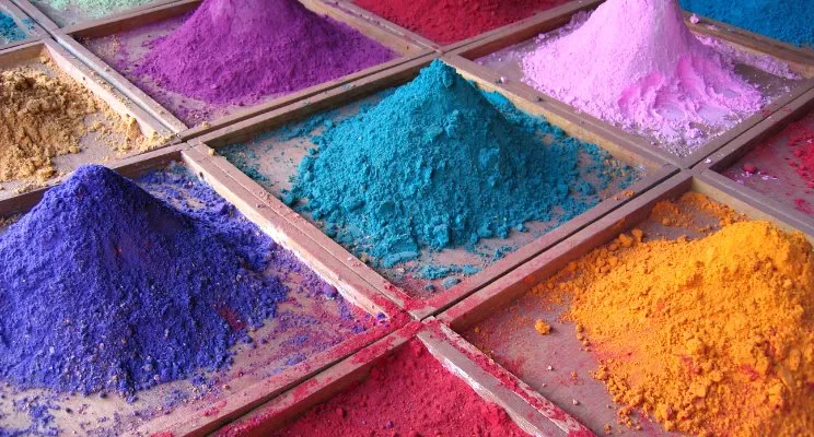
Why do you get the blues, go green with envy or see red with rage?
Colour is a truly human experience. The development of pigments and dyes goes back to the origins of humankind, and trade in the rarest ingredients made kingdoms rise and fall.
While the perception of a colour is subjective, some colour effects have a more universal meaning: blue is a cool colour because of its physical relationship with water and the sky, and red is a warm colour through its connection to fire. A second thing to consider is that the perception of colour is culturally based. The emotional associations I talk about here come from a western perspective (for more on the cultural significance of colour there are great articles like this one).
As designers we can use these tools, and people’s existing preferences for colour, to our advantage. If you want an exciting experience, use lots of warm colours like red. To demonstrate credibility and professionalism, use lots of blue.
One of the easiest ways to do A/B testing is simply to swap out colours and see how users react to a change that simple.
Mere colour, unspoiled by meaning, and unallied with definite form, can speak to the soul in a thousand different ways.
Oscar Wilde
There is a proven scientific connection between the colour of products and the urge to purchase. Every time you see a colour, a chain of reactions takes place in the hypothalamus in your brain. Hormones are released to your thyroid, triggering emotions that affect your behaviour. In fact, 62% to 90% of purchasing decisions are based on colour. So digging deeper into the psychology of colour can significantly improve those elusive conversions for your website.
The right colour palette can give your product or service a greater chance of recognition and respect from your chosen audience. Brands use these colour perceptions all the time to position themselves and to connect with their customers through emotion.
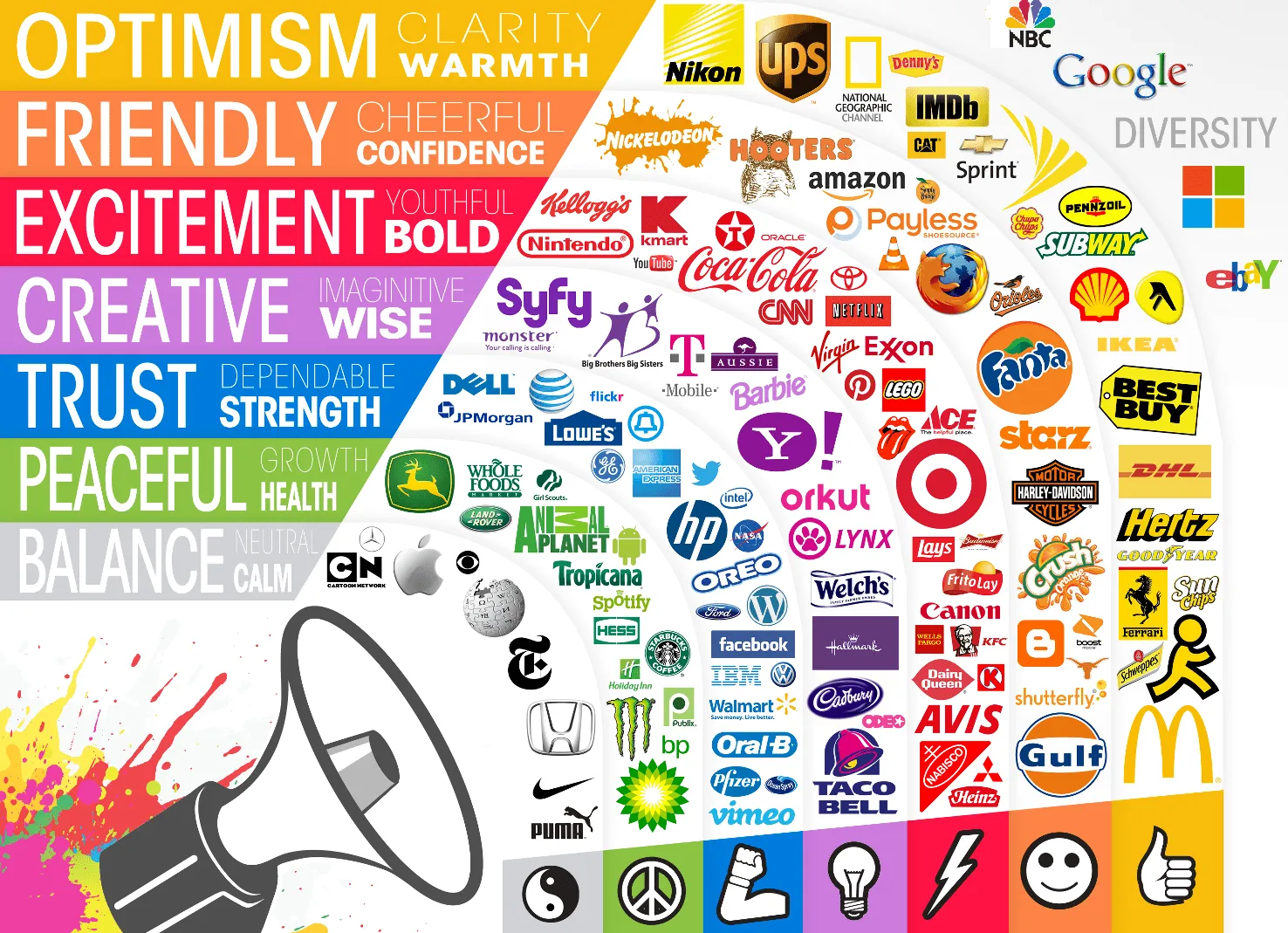
- Green: growth (financial or physical) and health. Monster, Starbucks, Standard Chartered, Tropicana, Spotify, BP.
- Purple: imagination and wisdom. Yahoo, Taco Bell, Barbie.
- Blue: trust, confidence and dependability. Lowe’s, HP, Oreo, Facebook, Vimeo, WordPress, Ford, Dell.
- Red: excitement, urgency and boldness. Target, Canon, Lego, Pinterest, Coca-Cola, CNN, Nabisco, YouTube.
- Orange: cheerfulness and relationship-building. Gulf, Nickelodeon, Firefox.
- Yellow: optimism and forward-thinking. Best Buy, IKEA, UPS, Nikon, McDonald’s.
- Black: authority and power. Visa, Adidas, MTV.
- White: purity and innocence. Google, Yelp.
Spending time on which colours will work for your brand or product goes a long way towards creating successful experiences for your customers or audience.