One app, one direction
Rebuilding the MyTelstra app, from backend migration to full front-end rebuild
- client
- Telstra · via Symplicit
- role
- UX design lead, leading the design team across squads and designing my own squad's features
- focus
- Design leadership · Design Ops · Design chapters · Mobile app · Onboarding · Release scoping
impact at a glance
- 3.9M → 5M
- app users, Mar 2020 to Jun 2022
- 14
- UX, visual and content designers led across squads
- 3.9M
- app users at the March 2020 launch
The problem space
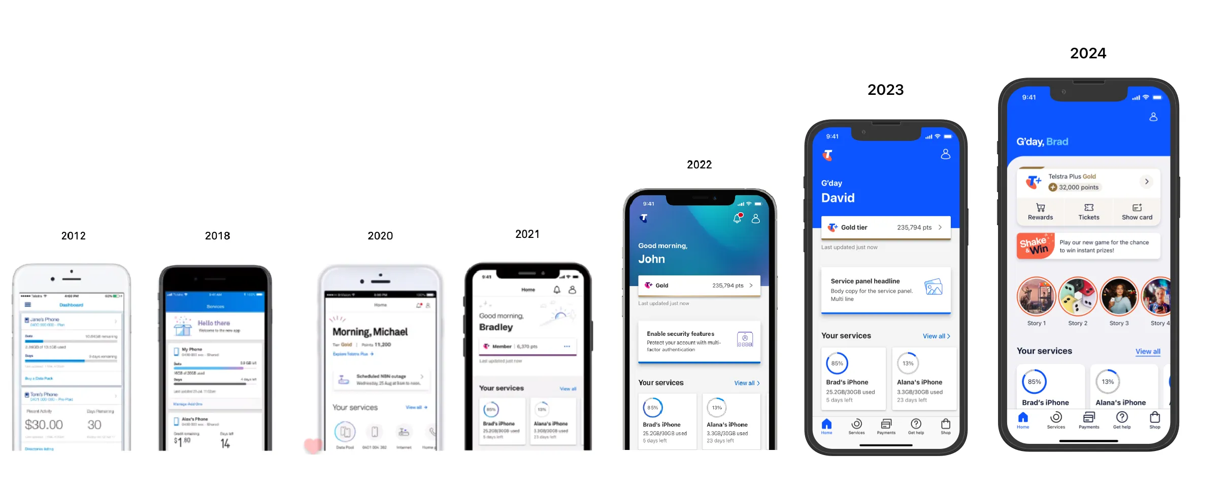
MyTelstra replaced the old Telstra 24/7 app: a high-volume, self-service native app (and web) used by millions of Telstra customers to manage their services.
The migration was tech-led. It began as a backend change, but it soon grew into a full front-end rebuild. Design hadn’t kept up with that growth. Designers sat inside individual squads, each shipping its own part of the app, and there was no shared design direction across them.
For an app this size, that meant inconsistent experiences between features, duplicated effort, and design decisions nobody could trace.
My role
I joined as UX design lead through Symplicit, and I did two jobs at once:
- Lead: I oversaw every squad and its designers, a team that grew to 14 UX, visual and content designers, and gave the work one cohesive direction.
- Squad designer: I designed a set of core features myself: onboarding, profile & settings, Telstra ID management, What’s new and service nicknames.
I partnered with product owners, engineering and delivery across the squads, representing design in discovery and solution workshops.
Process & artifacts
From squads to a design chapter
To get the speed and traceability a business of Telstra’s scale needs, I set up Design Ops and a Design Chapter model. Designers kept delivering inside their squads, but they now met as one chapter with shared standards, critique, and a single view of the whole app. That turned a group of separate squad outputs into one product.
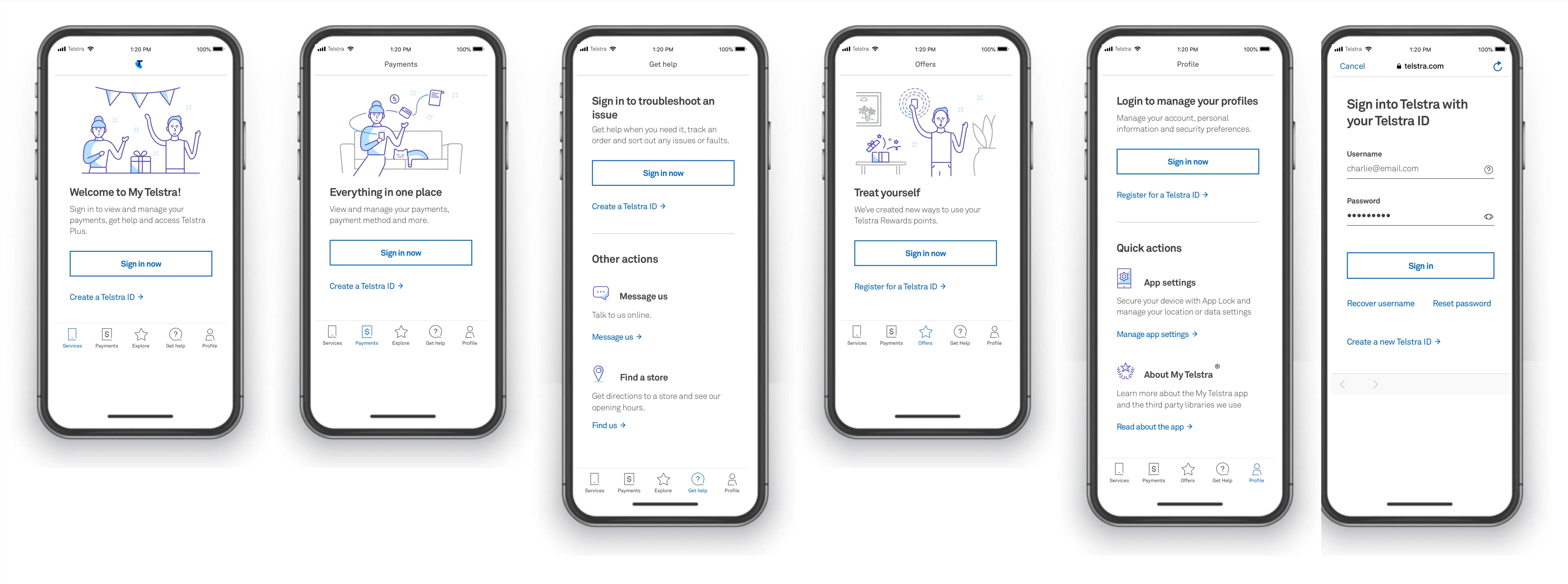
Onboarding
First impressions for millions of customers moving from Telstra 24/7: signing in, setting up, and understanding what the new app could do.
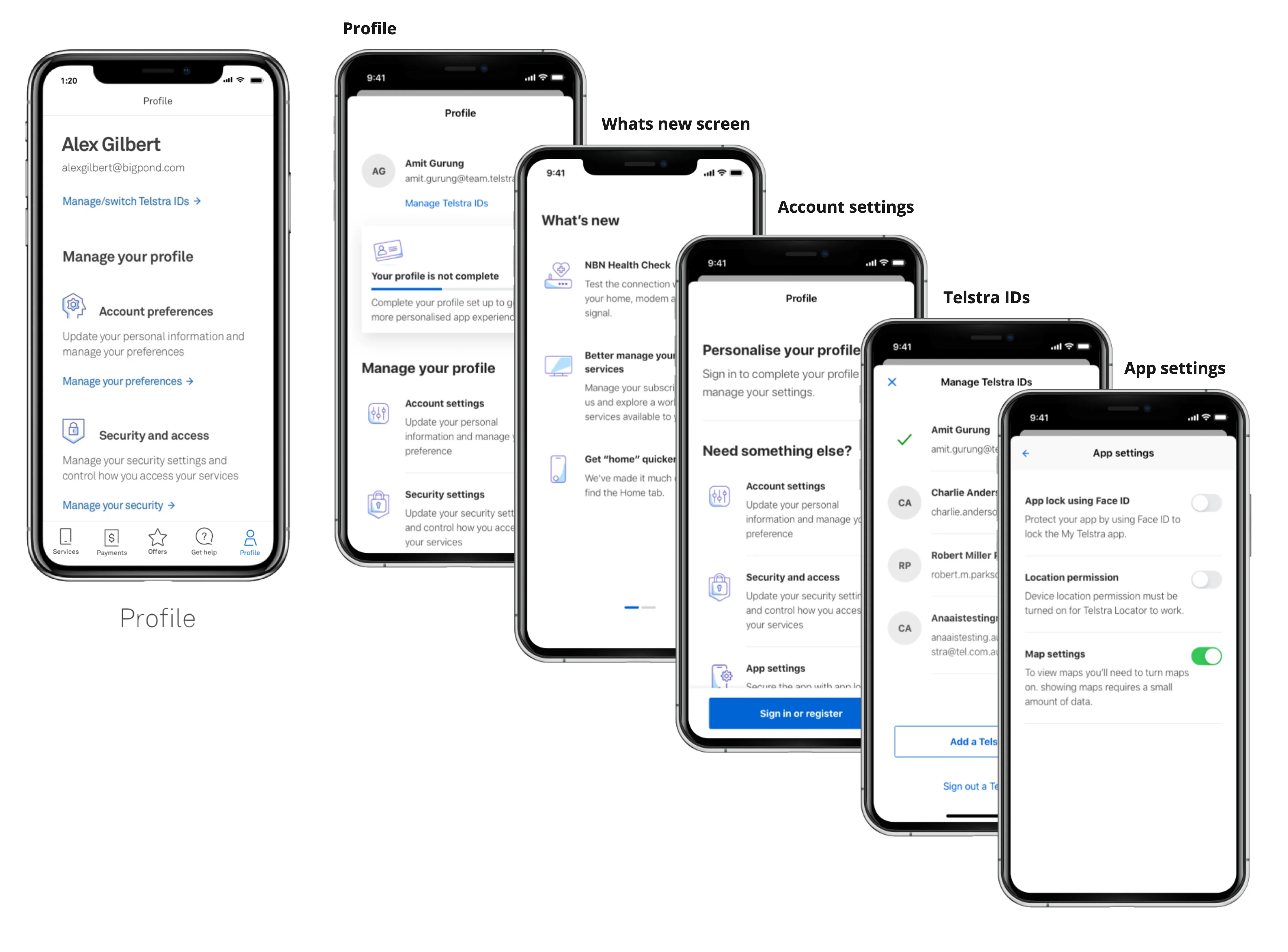
Profile, settings & Telstra IDs
One place to manage your personal details, security and app preferences (Face ID lock, location, maps), and to switch between the several Telstra IDs many customers juggle.
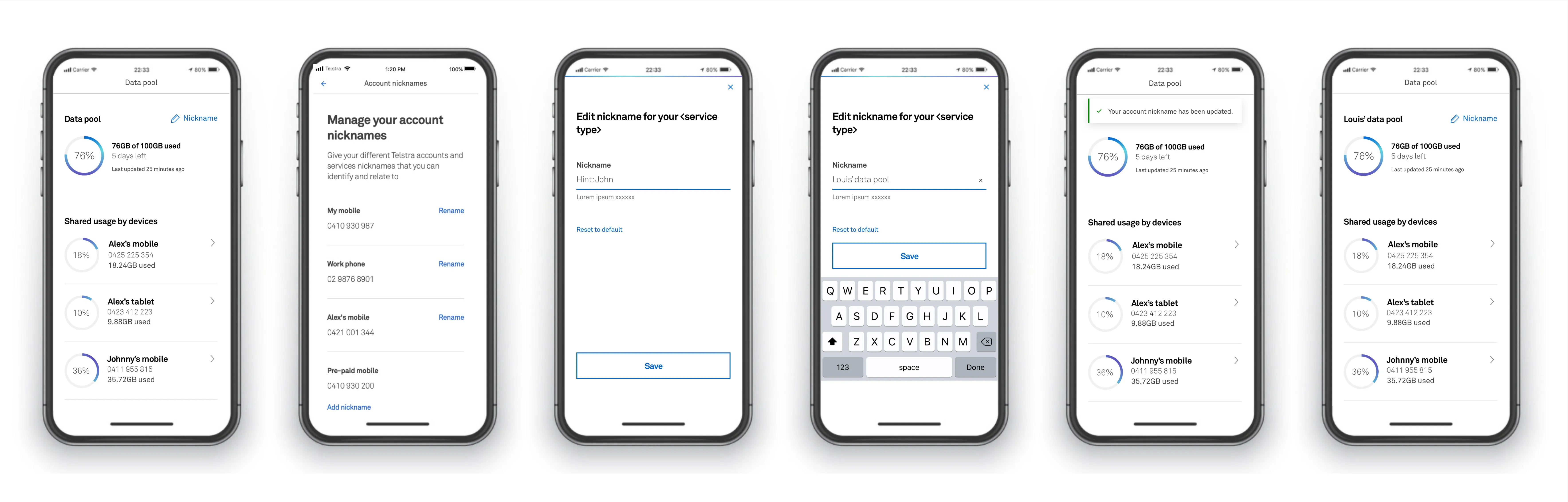
Service nicknames
Customers with several services couldn’t easily tell “0412…” from “0413…”. Nicknames let them name each service so they could spot it at a glance.
The hard call: re-scoping the launch
The rebuild was aimed at a November release, and with all the features we were trying to fit in, we weren’t going to make it. Rather than ship late and compromised, or quietly drop scope squad by squad, I ran a workshop with the stakeholders to agree two things:
- A core launch set: the features the app had to have at go-live, with everything else sequenced after it.
- A firm commitment to March 2020 for that launch.
That gave every squad the same finish line and a scope they could actually deliver.
Impact
The new MyTelstra app launched in March 2020 to 3.9M users. The platform we built kept growing after launch, to 4.5M users by June 2021 and 5M by June 2022.
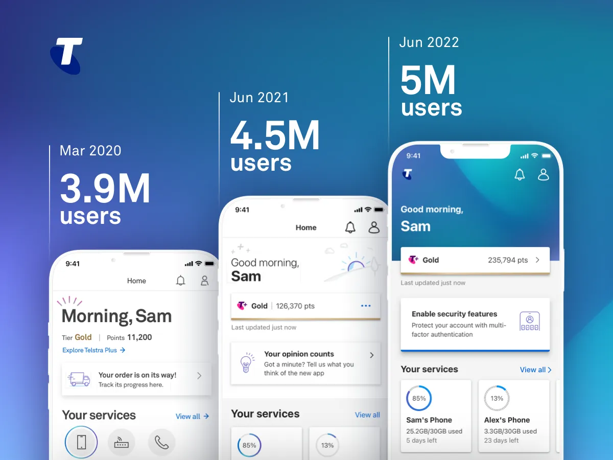
Just as important was how the team worked. Design moved from squads working in isolation to a single chapter with shared direction, and the Design Ops approach went on to shape how I’ve led teams since.